Painting; beginning my Self Portrait on the Gum Arabic Print
The primed red and ochre boards are our starting points. The boards are highly absorbent, and so both front and backs were primed, letting the board dry flat between. Here is a little article that I found on the' interweb' ! that I think is pertinent to why we primed our boards.
Why it is Good to Prime Your Canvas
Once you have a stretched canvas, the next step is to prime the canvas so you can paint on it. A primer seals and protects the support, makes the canvas less absorbent, helps the colors stand out, can provide a smoother surface with enough tooth for the paint to bind onto, and is therefore an excellent surface for both acrylic and oil. With a ready-made gesso suitable for both acrylic and oil painting, priming is very easy.
We used a mixture of PVA glue and water, in these proportions:
one third glue: two thirds water

Once primed, (sides too) it's possible to stretch sugar paper to the board to work on, stretching it from opposite corners, and taping it to the back of the board.
We actually painted UN- primed boards, with Ochre and crimson paint (one half of each board in each colour), which gives a coloured Imprimatura. If you decide to use this method (ie painting on the front) it is important to prime the back with a PVA solution to stop the board 'curling'. The paint was applied with a flick action, in different directions.
Imprimatura literally means first coat (of paint). It is usually a dilute layer of paint, often in an earth tone such as raw umber, and allows the background white to show through. It just takes the edge of the white canvas, although sometimes one might want that white.
Grisaille is another term that gets bandied about; it really means doing an underpainting in a colour (strictly speaking grey) before applying the final layers of (often thinner) paints or glazes on top. Before doing the grisaille layer, the classical painter usually sketched out his painting using an umber colour on to the base layer or imprimatura, then found the lights and darks in the Grisaille layer. I think in our case, the Grisaille is a mixture of Prussian Blue and Brown or Umber mixed together, to paint the dark areas of the face.

With that in mind, we are asked to do a wet on dry attempt at our distorted self portrait, once again using only 2 darks and 2 lights. I really found restricting my paint palette to these colours incredibly liberating and helpful.

Here (above) is my early first painting, using a coloured paper as my 'imprimature' and then forging ahead with the darks; a few tentative lights are added (yellow)


Imprimatura literally means first coat (of paint). It is usually a dilute layer of paint, often in an earth tone such as raw umber, and allows the background white to show through. It just takes the edge of the white canvas, although sometimes one might want that white.
Grisaille is another term that gets bandied about; it really means doing an underpainting in a colour (strictly speaking grey) before applying the final layers of (often thinner) paints or glazes on top. Before doing the grisaille layer, the classical painter usually sketched out his painting using an umber colour on to the base layer or imprimatura, then found the lights and darks in the Grisaille layer. I think in our case, the Grisaille is a mixture of Prussian Blue and Brown or Umber mixed together, to paint the dark areas of the face.

This is a sketch painting from Ciara's demo; where she is using umber and Prussian blue to map out the dark sides of the face, and also very importantly, the background. Note when a dark background meets the objects head, it is light (poss reflected light) and vice versa. Its the rule!!
This first bit of underpainting should go on quite thickly with not too much water being used.
We leave blank any areas where the brights will go later, and then these will be done in lemon yellow. As above.
With that in mind, we are asked to do a wet on dry attempt at our distorted self portrait, once again using only 2 darks and 2 lights. I really found restricting my paint palette to these colours incredibly liberating and helpful.

Here (above) is my early first painting, using a coloured paper as my 'imprimature' and then forging ahead with the darks; a few tentative lights are added (yellow)
My primed red board, as an imprimatura for my self portrait.
I had 3 options when starting this painting!
1. Draw my image on to the prepared board, using a light oil pastel
2. Stick my photocopied image on to the board (saving me time re drawing it)

3. Work on my Gum Arabic print, which is on lovely thick watercolour paper, see below:

I decided on no 2 option.


This is the first stage where I added in my darks. As I was working at home, I could only find
some old poster paint, not very good, and not as deep a blue as the School Prussian. Oh well.
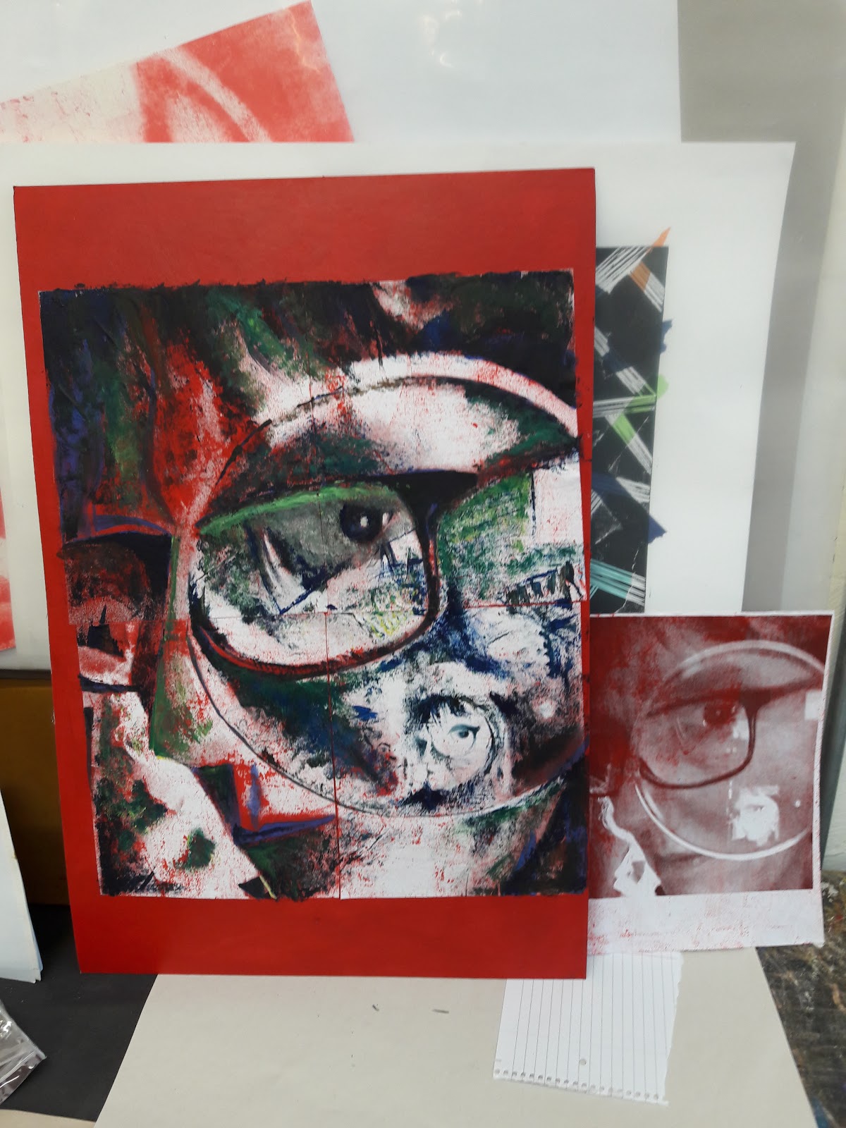
A bit further on! to the right, you can see I was using another image to help me. Here I am adding in the mid tones. rushing my fences a bit; in our next class, Ciara explained that the mid tones are the 'contouring' ones, where each brush stroke is used to model any shapes, eg the cheek. The mid tones are achieved by adding a light to a dark, eg yellow to a blue, and will result usually in a green of some sort.


I regret at this stage that I didn't use the palette knife in the earlier stages (which I did in some of my practice paintings. I also regret not using Cobalt Blue which I preferred in earlier experiments, for instance in the painting above right.
Ciara also explained that it is important that the background contrasts with the subject but doesn't compete with it. This is done by 'flattening' it, using horizontal and vertical lines.


Comments
Post a Comment